Advanced Local | Native App Redesign

Advanced Local | Native App Redesign

Project overview - Advance Local
Advance Local, a subsidiary of Advance Publications is a national news conglomerate, with a focus on regional news in digital and print media. Across native apps and web, they have over 50+ million monthly unique users.
Until the end of 2019, Advance’s revenue came from two places: physical newspaper delivery, and ad placement revenue. Advance then introduced a third revenue stream – gating premium content behind a subscription paywall.
In support of this third revenue stream, I was brought on to lead an app redesign with a focus on paywalls. This was the first time in over 5 years the app had any design support.

What a reader wants from Advance Local
When I joined the project, it was still in its discovery phase. The user research team had gathered insights from our readers by conducting user surveys.

Reader cohorts - customer journey
I was provided with reader cohorts, that I matched to a customer journey funnel.
The steps of the funnel are:
Awareness: educating and familiarizing prospects buyers
Consideration: targeting prospects that are actively using our product
Conversion: competition has been considered, and prospect is ready to purchase
Retention: engaging existing customers to continue buying products

App Assessment | Control - NJ.com on iOS
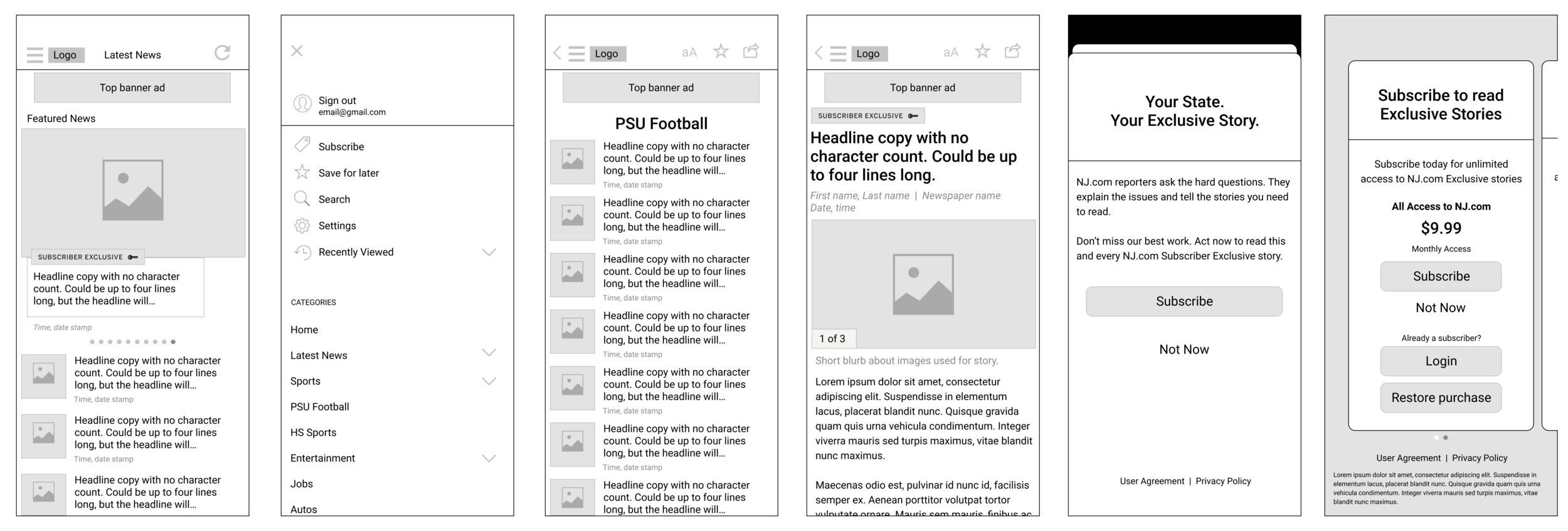
First impression, the app looks “generic”. Much of the experience is hard to read. The top navigation is hard to see next to the display ad. The display ad is anchored to the top of all content screens. The hamburger is a catch-all, followed by a logo, and refresh icon.

Method - Affinity Mapping
After my app assessment, I created an affinity map, which helped me identify and group three areas of improvement: visual design, navigation, and messaging touch points.
In tandem with this work, my team developed a design system that outlined styling criteria to incorporate for the redesign.
Lastly, within messaging touch points, two customer journeys existed: awareness and consideration.

Method - Affinity mapping
Design system
Whether it was an accessibility concern, or poor line and letter spacing, the entire product was hard to read, and every screen was designed as a one-off.
Concerns
- Reading is difficult
- Sizes of fonts are all one-offs
- Colors are inconsistent
- Local market branding is not represented


App redesign
User experience | navigation from homepage
Assumption: removing user centered actions from the hamburger will improve news category navigation
Assumption: anchoring search at the top of news categories provides improved context of the search
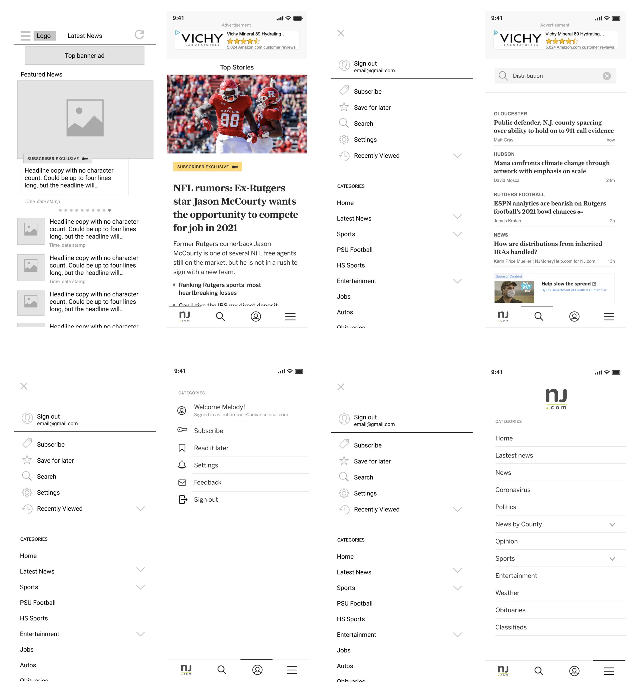
Assumption: moving the navigation to the bottom provides better ergonomics
Assumption: moving the navigation to the bottom, provides affordances for additional tabs for a future state

Method - Affinity mapping navigation
Navigation
The hamburger menu was a catch-all for everything within the app, which made the app hard to navigate.
Questions
- Where is search?
- Where is my account information?
- What are all the topic categories?
Redesign assumptions
Assumption: When navigating to an article page, the navigation bar should display actions that are relevant to the functions being performed.
Assumption: A reader will only want to perform four actions from the article page: share, back, home, or tapping article links to explore more about the topic.
Account Settings
Utilizing a heuristic approach to account settings, helped group relative content.
Questions- Where can I find my preferences?- Where can I find my profile settings?- How do I search?
Redesign assumptions
Assumption: adding an avatar to the navigation will promote user settings
Assumption: grouping user centered actions is a well known heuristic.
Assumption: the capability to view account status is valuable when making a choice to cancel or renew.


Method | Affinity mapping
Subscription - awareness (messaging touch points)
Subscription awareness is hard to find, and lacking awareness throughout the product.
Questions:
- What is a subscription?
- Why are some articles blocked?
- When did this change take place?
Redesign assumptions
Assumption: “priming” will introduce the concept of account creation and subscribing
Assumption: adding account settings will increase sign up awareness/engagement.
Assumption: providing context language on paywall will foster understanding.
Subscription - consideration (messaging touch points)
Subscription consideration provides no framing language or value proposition. It leaves a user unsure of the benefits.
Questions:
- What do I get with a subscription?
- What are the payment options?
- Is there a guaranteed refund?
Redesign assumptions
Offer page
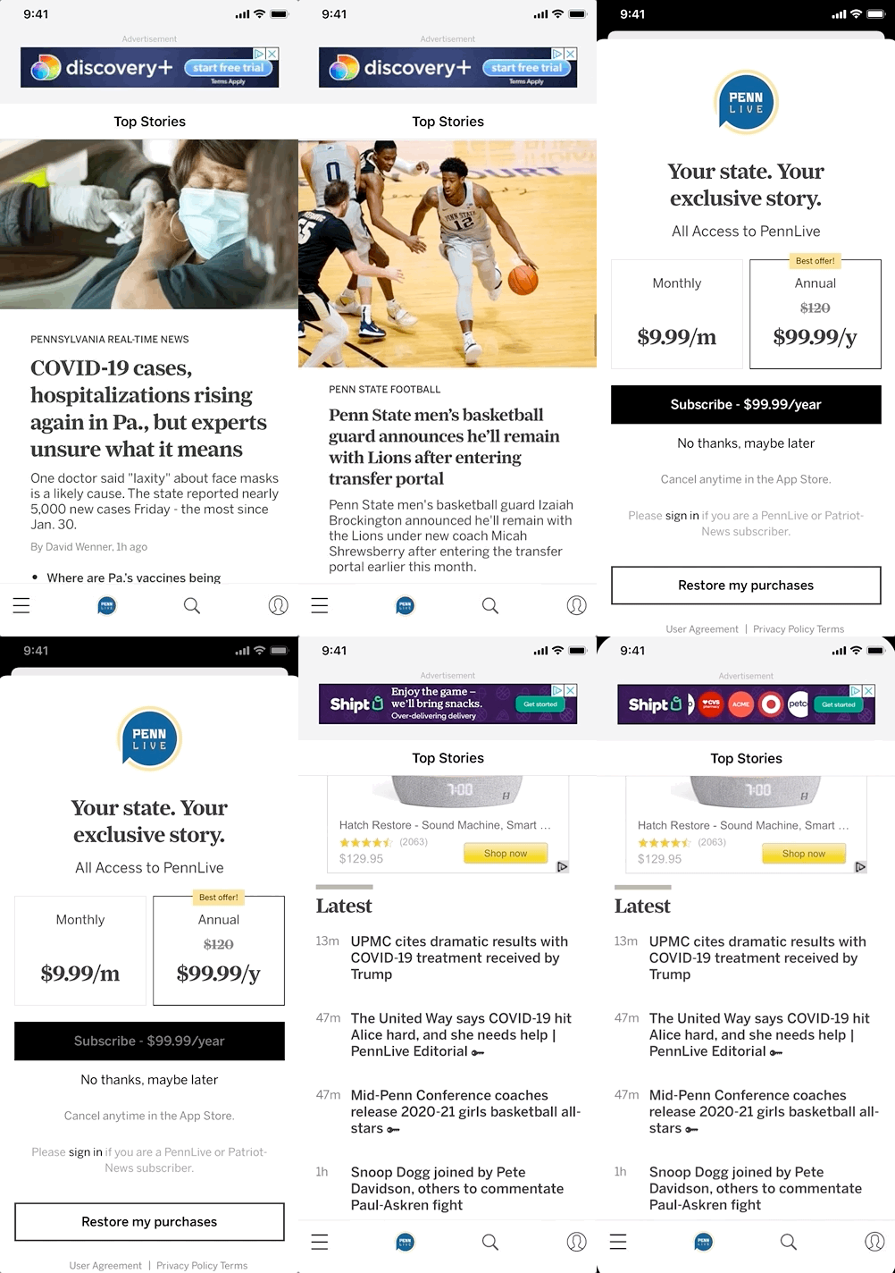
Assumption: local market branding will promote trust in product
Assumption: choice framing (side by side) with “best offer” will encourage buying the more expensive, but better deal offer.
Assumption: adding “cancel anytime” will combat buyers remorse.
Paywall
Assumption: Including a value proposition of the benefits you get with subscribing will provide enough context for considering to purchase.

Conclusion
We modernized a five-year old code base, supporting a brand new consumer revenue-centric app release. The release debuted our new design system, and consumer revenue branding.
Within the first two months of the redesign’s launch, the NJ.com iOS app produced seven figures in revenue (500+ new subscriptions). The previous best month was October with 127 new subscriptions.
With the success of this test, the redesign was rolled out into all 10 local markets in January, and all garnered similar success.
However, the user base is still very small for all 10 markets, less than 1% of our web audience. I believe adding more customization options to the app will help build a bigger and loyal audience. Additionally, awareness and consideration efforts are needed for continued growth and success.

